
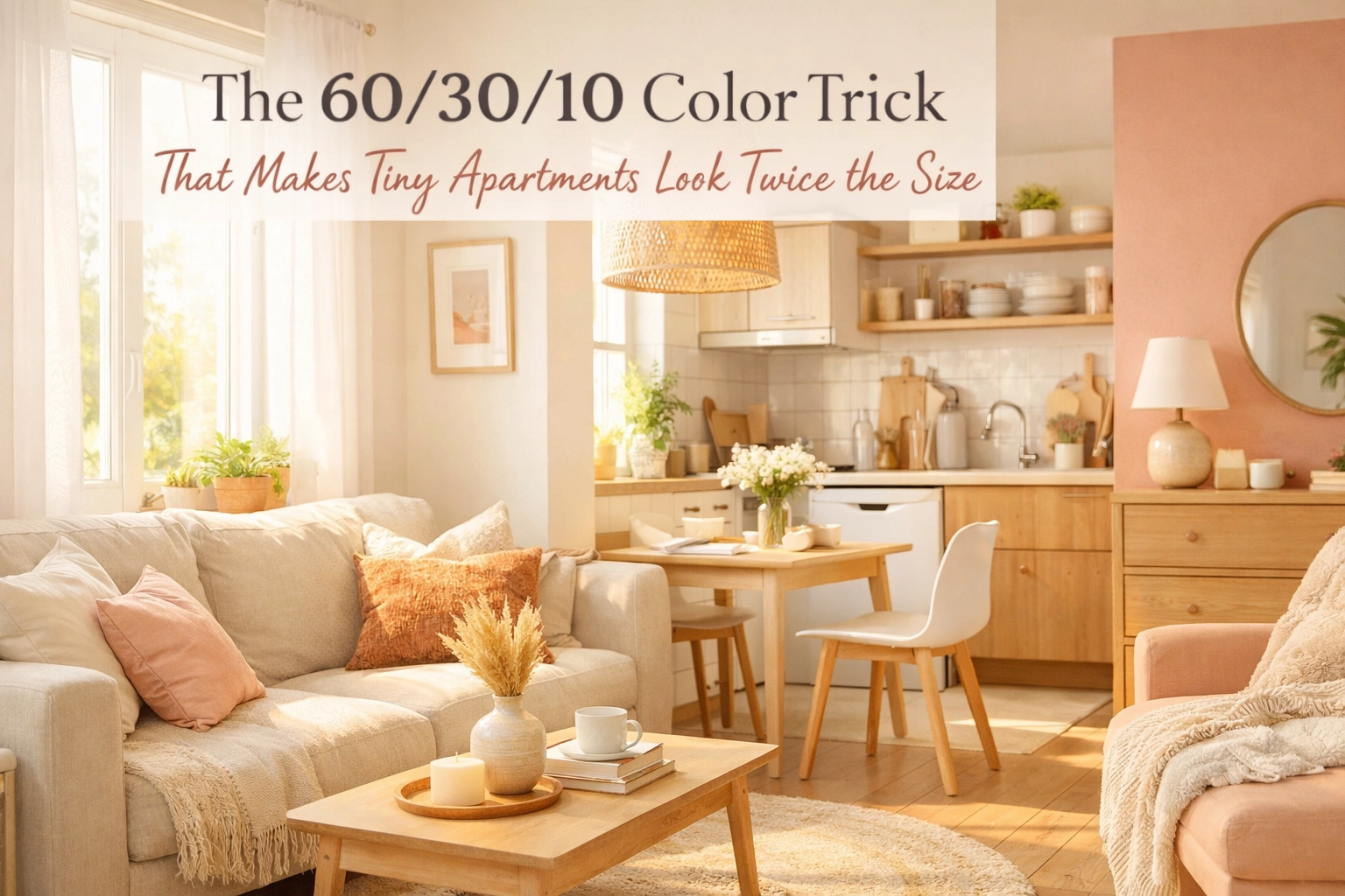
I'll never forget the first time I walked into my friend's studio apartment. On paper, it was 450 square feet of cramped quarters. In reality? It felt like a spacious, airy retreat that somehow defied the laws of physics. Her secret wasn't knocking down walls or installing floor-to-ceiling windows, it was something far simpler and infinitely more affordable: the 60/30/10 color rule.
If you've ever felt like your tiny apartment is closing in on you, or wondered why some small spaces feel expansive while others feel claustrophobic, the answer often lies in how color is distributed throughout the room. Today, I'm breaking down this game-changing design principle that transforms cramped quarters into visually balanced, surprisingly spacious sanctuaries.
This post contains affiliate links, which means I may receive a small commission at no cost to you if you make a purchase.
What Exactly Is the 60/30/10 Rule?
The 60/30/10 color rule is an interior design technique that's been around for decades, and for good reason, it works. This proportional approach to color distribution creates harmonious, balanced spaces by dividing your room's color palette into three distinct percentages:
60% – Your Dominant Color: This is your primary hue that covers the majority of your space. Think walls, large furniture pieces, and any other surface that takes up significant square footage. This color sets the overall mood and becomes the foundation everything else builds upon.
30% – Your Secondary Color: This complements your dominant color and adds depth without overwhelming. You'll typically see this on medium-sized elements like upholstered furniture, curtains, area rugs, or even an accent wall.
10% – Your Accent Color: This is where personality shines through. Applied to smaller accessories like throw pillows, artwork, lighting fixtures, or decorative objects, this pop of color creates visual interest and guides the eye around the room.
The beauty of this rule lies in its simplicity. Rather than throwing every color you love into a space and hoping for the best, you're creating an intentional color story that feels cohesive and purposeful. For small space decorating ideas, this principle becomes even more critical, because when space is limited, every design decision carries more visual weight.
Why This Rule Makes Small Apartments Feel Larger
Here's where the magic happens. The 60/30/10 rule doesn't just create pretty rooms, it fundamentally changes how we perceive space. When you anchor a small apartment with a dominant neutral or light color at 60%, you're essentially creating visual expansion. Light colors reflect more natural and artificial light, making walls appear to recede rather than close in.
The 30% secondary color then adds dimension and keeps the space from feeling flat or clinical. This is crucial in tiny apartments where everything exists in close proximity. Without that secondary layer, your space might feel open but also monotonous and uninviting. The secondary color creates subtle visual boundaries that help define different areas without breaking up the flow.
That final 10% accent color? It's what makes your eye travel naturally around the room. In design terms, we call this "visual movement." When your eye has a clear path to follow, from that teal pillow to the matching vase across the room, the space feels more dynamic and, counterintuitively, larger. Stagnant spaces where your eye has nowhere to land feel smaller and more cramped.
Moreover, this proportional approach prevents the overwhelming feeling that occurs when too many colors compete for attention. In a small apartment, visual clutter translates directly to perceived physical clutter. The 60/30/10 rule keeps things streamlined while still allowing for personality and style.
Choosing Your 60%: The Dominant Color Foundation
For small apartments, your dominant color choice can make or break the entire space. I always recommend starting with neutrals or light, airy tones for this foundational 60%. Think soft whites, warm grays, gentle beiges, or even pale blue or mint green.
Why neutrals? They're the visual equivalent of taking a deep breath. These colors create a sense of tranquility and spaciousness that's essential when you're working with limited square footage. A room painted in warm white or soft greige immediately feels more open than one painted in deep navy or forest green, regardless of the actual dimensions.
If pure neutrals feel too safe or sterile for your taste, consider "greiges" (gray-beige hybrids), warm taupes, or barely-there pastels. These still provide that airy, expansive feeling while introducing subtle character. I've seen small living rooms transformed simply by painting walls in a soft, warm white and adding a light gray sofa.
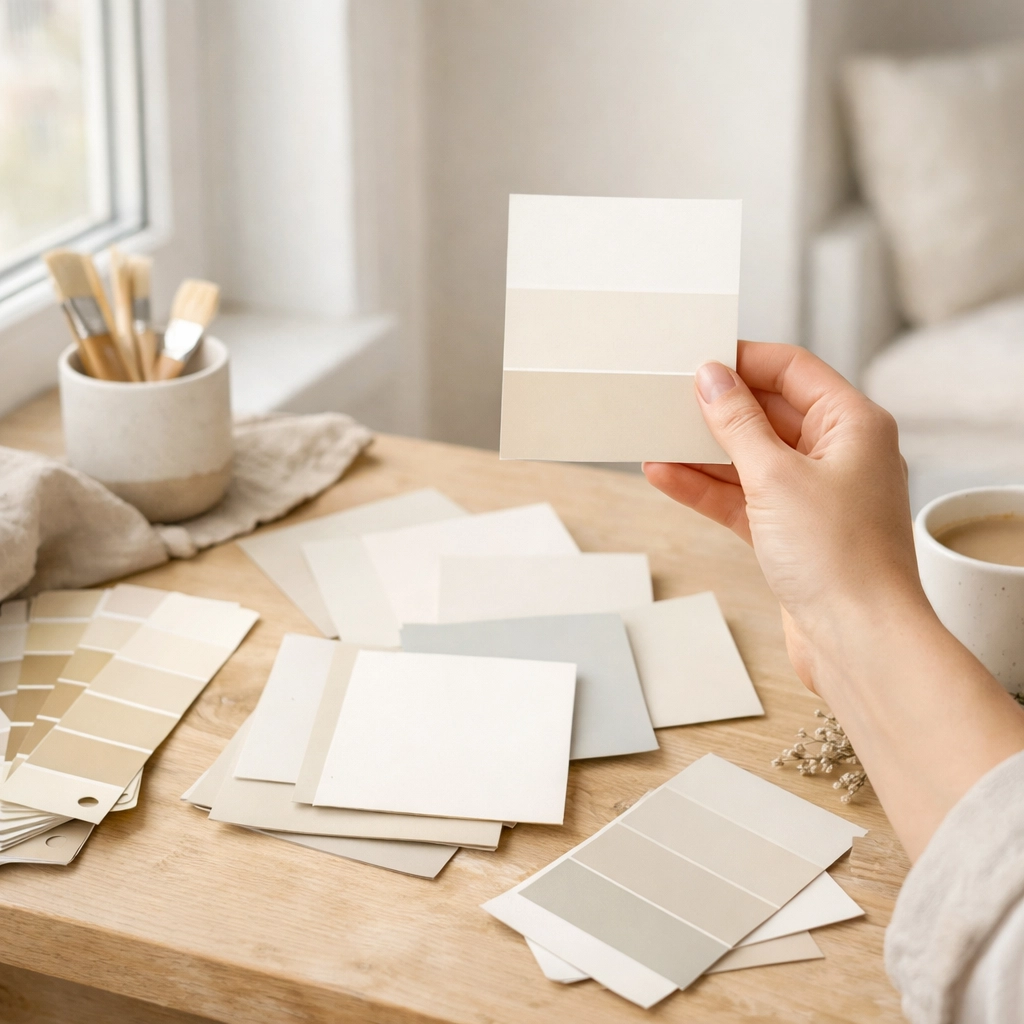
When selecting your dominant color, test it in your actual space. Colors behave differently depending on natural light exposure, ceiling height, and surrounding elements. Grab a few sample pots and paint large swatches on different walls. Live with them for a few days, observing how they look in morning light versus evening ambiance.
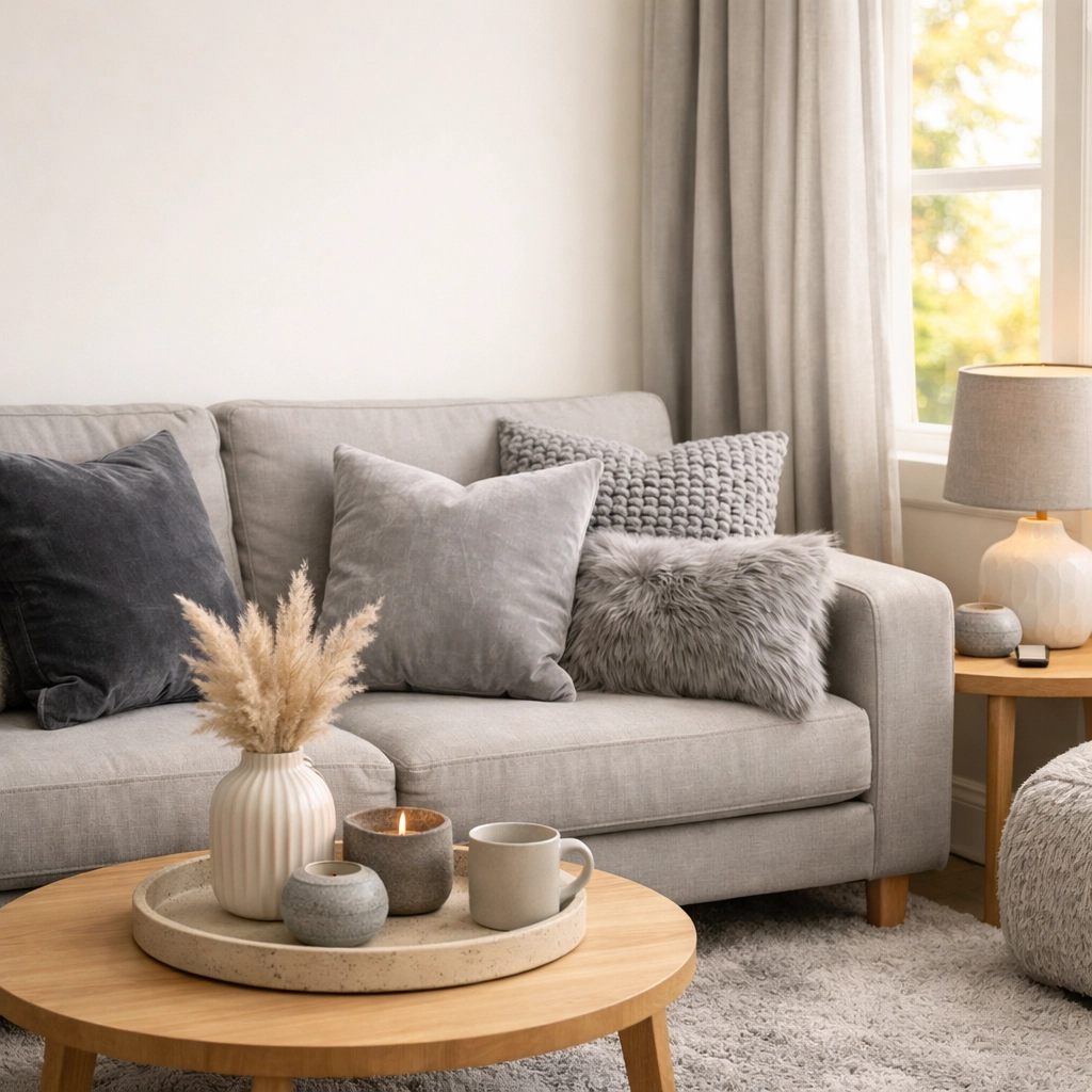
The 30% Secondary Color: Adding Depth Without Overwhelm
Once you've established your dominant color, it's time to introduce your secondary hue at roughly 30% of the space. This is where you can start introducing more personality and contrast while maintaining that sense of openness.
For small space decorating ideas, I love choosing a secondary color that's one or two shades deeper than the dominant color for a tonal approach, or selecting a complementary color for more drama. If your walls are soft white, consider a dove gray or warm taupe for your sofa and curtains. If you've gone with pale blue walls, a richer navy or complementary warm beige works beautifully.
This 30% typically shows up in:
- Upholstered furniture (sofas, accent chairs)
- Window treatments (curtains, blinds)
- Area rugs
- One accent wall (if you choose to create one)
- Bedding in bedroom spaces
The key is distribution. You don't want all your secondary color clumped in one corner. Spread it around the room to create visual balance. If your sofa is your secondary color, consider adding curtains or a rug in the same family to tie things together.
I've found that texture plays beautifully with the secondary color. A gray linen sofa paired with gray velvet pillows creates visual interest through texture variation while maintaining color consistency. This adds dimension without adding visual weight: perfect for small apartments.
The 10% Accent Color: Where Personality Pops
This is hands-down my favorite part of the 60/30/10 rule. That final 10% is where you get to have fun and inject your unique style into the space. Think of accent colors as the jewelry of your room: small but impactful touches that complete the look.
Your accent color should be bold enough to create visual interest but used sparingly enough not to overwhelm. Popular accent choices include:
- Jewel tones (emerald green, sapphire blue, ruby red)
- Warm metallics (gold, brass, copper)
- Rich earth tones (terracotta, mustard, burnt orange)
- Bold brights (coral, teal, magenta)
Distribute this 10% across multiple small items rather than one large piece. This creates that visual movement I mentioned earlier. Consider:
- Throw pillows
- Artwork and wall decor
- Decorative objects (vases, books, candles)
- Small accent furniture (side tables, poufs)
- Lighting fixtures
- Plants in colorful pots
The beauty of keeping accents to 10% is that you can swap them out seasonally or whenever you want a refresh without repainting or replacing major furniture. Switching from teal accents to coral in summer, or from gold to silver for the holidays, completely transforms your space for minimal investment.
For budget-friendly accent pieces, I frequently browse affordable home finds that won't break the bank but still deliver that pop of color your space needs.
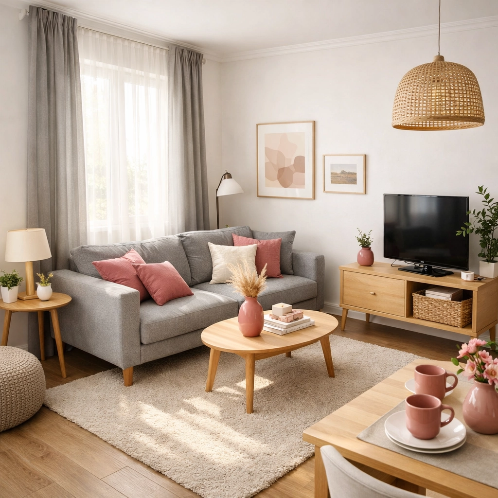
Putting It All Together: A Real Room Example
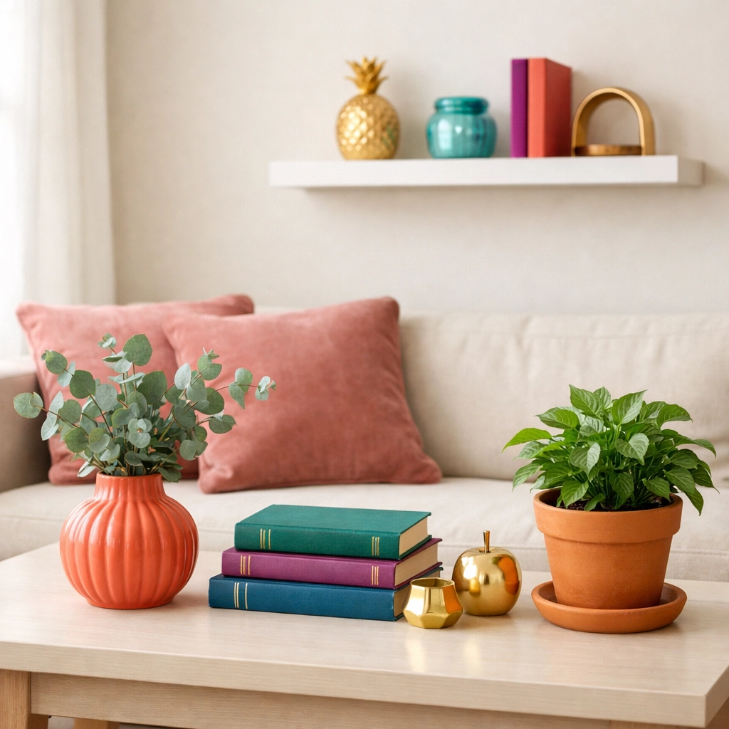
Let me paint you a picture of how this works in practice. Imagine a 350-square-foot studio apartment:
60% Dominant Color – Soft Warm White: Walls painted in warm white, paired with a light beige modular sofa and white floating shelves. This creates the airy, expansive foundation.
30% Secondary Color – Warm Gray: A medium-gray area rug anchors the living space, with matching gray curtains that puddle slightly on the floor (adding visual height). A gray upholstered headboard in the sleeping area ties the space together.
10% Accent Color – Dusty Rose: Throw pillows on the sofa, a piece of abstract art above the bed, a ceramic vase on the coffee table, and a small pouf in the corner: all in varying shades of dusty rose. The eye travels naturally from accent to accent, creating movement and interest.
The result? A studio that feels cohesive, intentional, and surprisingly spacious. Visitors consistently overestimate the square footage because the color distribution creates visual harmony rather than chaos.
Common Mistakes to Avoid
Even with a foolproof rule like 60/30/10, I've seen a few common pitfalls that can undermine the effect in small spaces:
Choosing dark colors for the 60%: Unless you're specifically going for a moody, cocooning effect, dark dominant colors will make small apartments feel smaller. Save the drama for larger spaces or use dark tones in your 30% instead.
Using too many accent colors: The rule is 60/30/10, not 60/30/5/3/2. Stick to one accent color (or at most, two very closely related shades) to maintain visual clarity.
Forgetting about undertones: Your warm-toned gray might clash with your cool-toned white, creating unintentional discord. Always consider undertones when selecting your color palette. Test colors side-by-side before committing.
Ignoring the ceiling and trim: These should typically match your dominant 60% color to avoid breaking up the visual flow. Painted ceilings in your dominant color can actually make them feel higher.
Being too literal with the percentages: This is a guideline, not a mathematical equation. 62/28/10 or 55/35/10 will work just fine. The principle matters more than precision.
Making It Work for Renters
I know many of you reading this might be thinking, "This sounds great, but I can't paint my rental walls." Good news: the 60/30/10 rule is incredibly renter-friendly when you get creative.
If you're stuck with builder-grade white or beige walls, those become your automatic 60%. Work with what you've got and focus your color choices on removable elements. Large area rugs, curtains, and furniture can establish your 30%, while accents remain easy to swap out.
For renters craving more dramatic change, consider removable wallpaper for one accent wall (counting toward your 30%), or use large-scale artwork and tapestries to introduce color without permanent alterations. I've seen studios completely transformed by strategic fabric choices and smart furniture selection: no paint required.
Your Small Space, Expanded
The 60/30/10 color rule isn't just another design trend that'll be forgotten next season: it's a foundational principle that creates visual harmony in any space, regardless of size or style. For those of us working with compact apartments, it's particularly powerful because it maximizes the perception of space while maintaining personality and warmth.
Start by identifying your dominant color: likely a soft, neutral tone that makes your walls recede and your space breathe. Layer in your secondary color through furniture and textiles, creating depth without division. Finally, have fun with that 10% accent, letting your unique style shine through in carefully curated pops of color.
The magic of this approach is its flexibility. As your style evolves or seasons change, you can easily swap out that 10% accent or even adjust your 30% secondary color without starting from scratch. Your small apartment deserves to feel spacious, intentional, and unmistakably yours: and the 60/30/10 rule is your roadmap to getting there.
Transform your tiny apartment into a space that feels twice its size, one thoughtful color choice at a time.
Warmly,
Maria
P.S. For more small space decorating ideas and color inspiration, come hang out with us on our Charming Homescape Pinterest boards!
Leave a Reply