
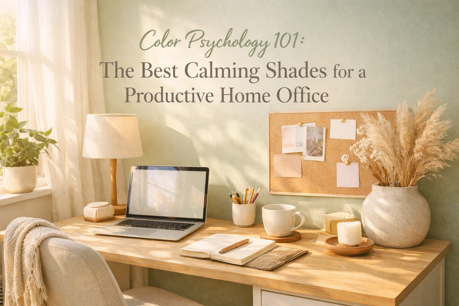
Ever sat down at your desk, ready to tackle that to-do list, only to feel… scattered? Restless? Like you just can’t quite focus? I used to blame it on my caffeine intake or my wandering mind, but here’s what I discovered: the colors surrounding me were playing a much bigger role in my productivity than I’d ever realized.
This post contains affiliate links, which means I may receive a small commission at no cost to you if you make a purchase.
Color psychology isn’t just some woo-woo design trend, it’s actual science about how different shades affect our mood, energy, and yes, our ability to get stuff done. And when it comes to creating a home office that helps you stay calm, focused, and productive (without needing your fifth coffee by 11 AM), choosing the right colors is honestly a game-changer.
So let’s dive into the shades that science says work best for creating that perfect productive-yet-peaceful workspace vibe.
Why Blue is Your Brain’s Best Friend
If there’s one color that consistently tops the charts for home office productivity, it’s blue. And I mean, think about it, there’s a reason so many corporate offices have blue accents everywhere. Blue creates this beautifully balanced atmosphere that somehow manages to calm your nervous system while keeping your mind sharp and alert.
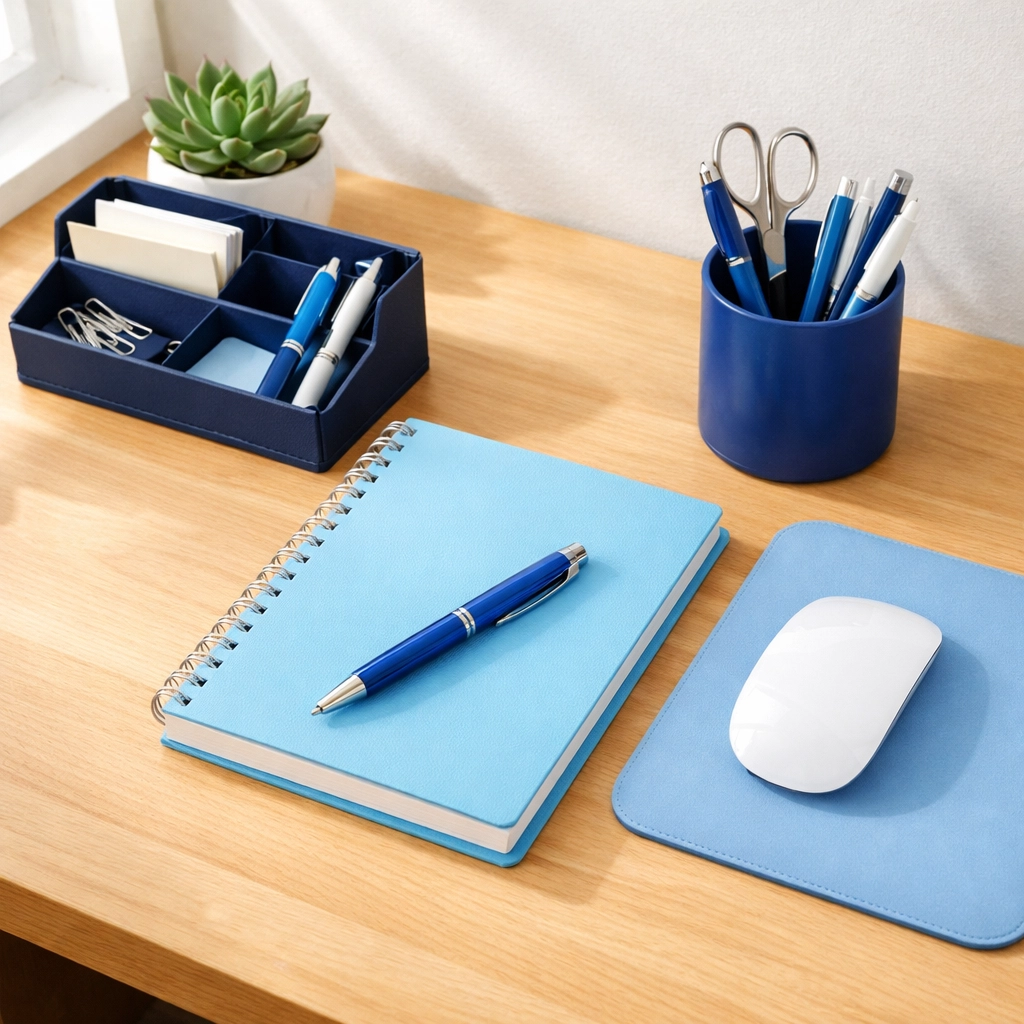
What I love most about blue is its versatility. Stronger, deeper shades of blue, think navy or cobalt, actually support complex thought processes and problem-solving. These are perfect if your work involves a lot of analysis, writing, or strategic thinking. On the flip side, lighter blues like sky blue or powder blue improve concentration and are gentler on the eyes for those marathon work sessions.
Blue works its magic by promoting feelings of tranquility while simultaneously stimulating mental activity. It’s like having a calm, focused companion in the room with you. Studies have shown that blue enhances wakefulness (goodbye, mid-afternoon slump!) and supports clear communication, super helpful if you’re on video calls all day or need to articulate complex ideas.
For your home office, consider painting an accent wall in a soft periwinkle or adding blue through desk accessories, artwork, or even your chair upholstery. The key is finding that shade that makes you feel both relaxed and ready to tackle whatever’s on your plate.
Green: The Eye’s Natural Resting Place
If you’re someone who stares at screens for hours on end (guilty as charged!), green might just become your new favorite color. As the most restful color for the human eye, green reduces eye strain and fatigue, which is honestly worth its weight in gold when you’re deep in a project.
But green does so much more than just protect your peepers. It promotes balance and calmness without making you drowsy, which is that sweet spot you need in a workspace. Unlike some calming colors that might make you want to nap, green keeps you alert while taking the edge off stress.
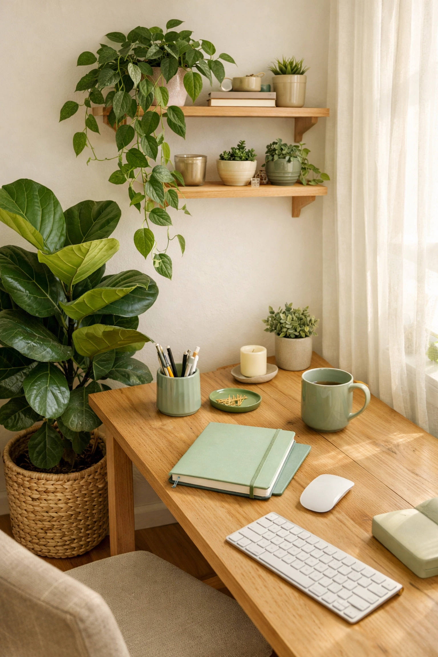
I’ve noticed that green particularly shines when I’m feeling overwhelmed by my task list. There’s something about this natural, grounding color that helps me feel more centered and capable of handling whatever comes my way. Research shows it also encourages innovative thinking, perfect for creative problem-solving or brainstorming sessions.
Consider incorporating green through plants (hello, double benefits!), a sage green feature wall, or green desk accessories. Even adding artwork with lush greenery can bring these calming, focus-enhancing benefits into your space. Olive, sage, and mint are particularly lovely for creating that cozy living space feeling while keeping productivity high.
The Surprising Role of Yellow (Use Sparingly!)
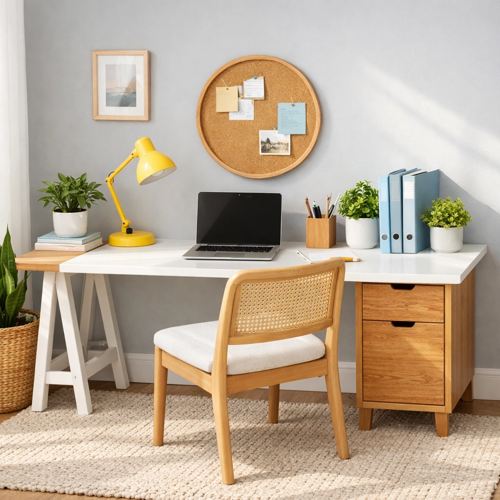
Now, yellow is a bit of a wild card in the home office color palette. On one hand, it’s absolutely brilliant for sparking creativity, optimism, and energy. Those sunny, cheerful vibes can genuinely lift your spirits and get those creative juices flowing when you need fresh ideas.
But: and this is important: too much yellow can actually backfire. Excessive yellow exposure has been linked to increased anxiety and frustration, which is obviously not what we’re going for in a productive workspace. Think of yellow as the hot sauce of your color scheme: a little goes a long way.
I recommend using yellow as an accent rather than a dominant color. A yellow desk lamp, a piece of artwork with yellow highlights, or even a vase of fresh flowers can bring that energizing pop without overwhelming your senses. Soft, muted yellows like buttercream or pale gold work better than intense, bright yellows for maintaining that balance between stimulation and calm.
The Understated Power of Neutrals
Let’s talk about neutrals for a second, because they deserve way more credit than they get. Grays, whites, beiges, and taupes might seem boring at first glance, but they’re actually productivity powerhouses that create a calm, distraction-free environment for focused work.
Neutrals provide a restful backdrop that doesn’t compete for your attention. When your walls and major furniture pieces are in neutral tones, your mind has less visual noise to process, which means more mental energy for the work that matters. Plus, neutrals are incredibly versatile: they let you switch up accent colors seasonally or based on your mood without needing a complete overhaul.
Warm grays, creamy whites, and soft taupes work particularly well for creating that cozy living space feeling in a home office. They make the room feel larger and more open while maintaining an inviting atmosphere. Layer different textures in similar neutral tones to keep things interesting without introducing color-related stress.
The Secret Sauce: Balance is Everything
Here’s what I wish someone had told me when I first started thinking about office colors: it’s not about choosing just one “perfect” shade and painting your entire room that color. That’s actually where most people go wrong. Too much of any single color, even the calming ones, can have counterproductive effects.
The real magic happens when you create a balanced color palette that combines your chosen calming primary color with supporting neutrals and maybe one energizing accent. For instance, you might paint three walls a soft gray, add a blue accent wall behind your desk, incorporate green through plants and artwork, and throw in a few yellow accessories for creative energy.
This layered approach allows you to tap into the benefits of multiple colors while preventing any single shade from overwhelming your space. It creates visual interest without chaos, and gives your eyes different “resting places” throughout the room.
Putting It All Together: Your Action Plan
So how do you actually implement all this color psychology goodness in your own home office? Start by assessing your specific needs. Do you need help staying focused during long work sessions? Blue and green should be your primaries. Looking to boost creativity and innovation? Layer in some yellow accents with your calming base colors.
Consider the natural light in your space, too. North-facing rooms tend to feel cooler, so warmer versions of your chosen colors (like warm gray instead of cool gray, or sage green instead of mint) can help balance things out. South-facing rooms with lots of warm light can handle cooler tones beautifully.
Don’t forget that you can introduce color through multiple elements beyond just paint. Artwork, textiles like curtains or a rug, desk accessories, storage boxes, and of course, plants all contribute to your overall color scheme. This makes it easier to experiment and adjust without major commitments.
If you’re working with a rental or just aren’t ready to paint, focus on removable color elements. A large piece of artwork, a statement rug, or even swapping out your desk chair for one in your chosen calming shade can make a significant difference in how the space feels and functions.
Creating Your Productive Sanctuary
At the end of the day, your home office should be more than just a place where you complete tasks: it should be a space that actively supports your wellbeing and productivity. The colors you choose play a surprisingly powerful role in making that happen.
By understanding how different shades affect your mood and mental state, you can intentionally design a workspace that helps you stay calm under pressure, focused when it matters, and creative when you need fresh solutions. Whether you opt for the focused tranquility of blue, the balanced calm of green, or a carefully curated neutral palette with strategic pops of color, you’re taking control of your environment in a way that genuinely impacts your work quality and daily experience.
Remember, there’s no single “perfect” color scheme that works for everyone. The best approach is to start with the research-backed calming colors we’ve discussed, then adjust based on your personal response and specific work needs. Pay attention to how you feel in the space, and don’t be afraid to make changes if something isn’t working.
Your home office is your domain: make it a place where you can do your best work while feeling genuinely good about spending time there.
Warmly, Maria
P.S. For more budget-friendly ideas and cozy vibes to transform your workspace into a productive haven, come hang out with us on our Charming Homescape Pinterest boards: https://uk.pinterest.com/Charming_Homescape/
Leave a Reply